
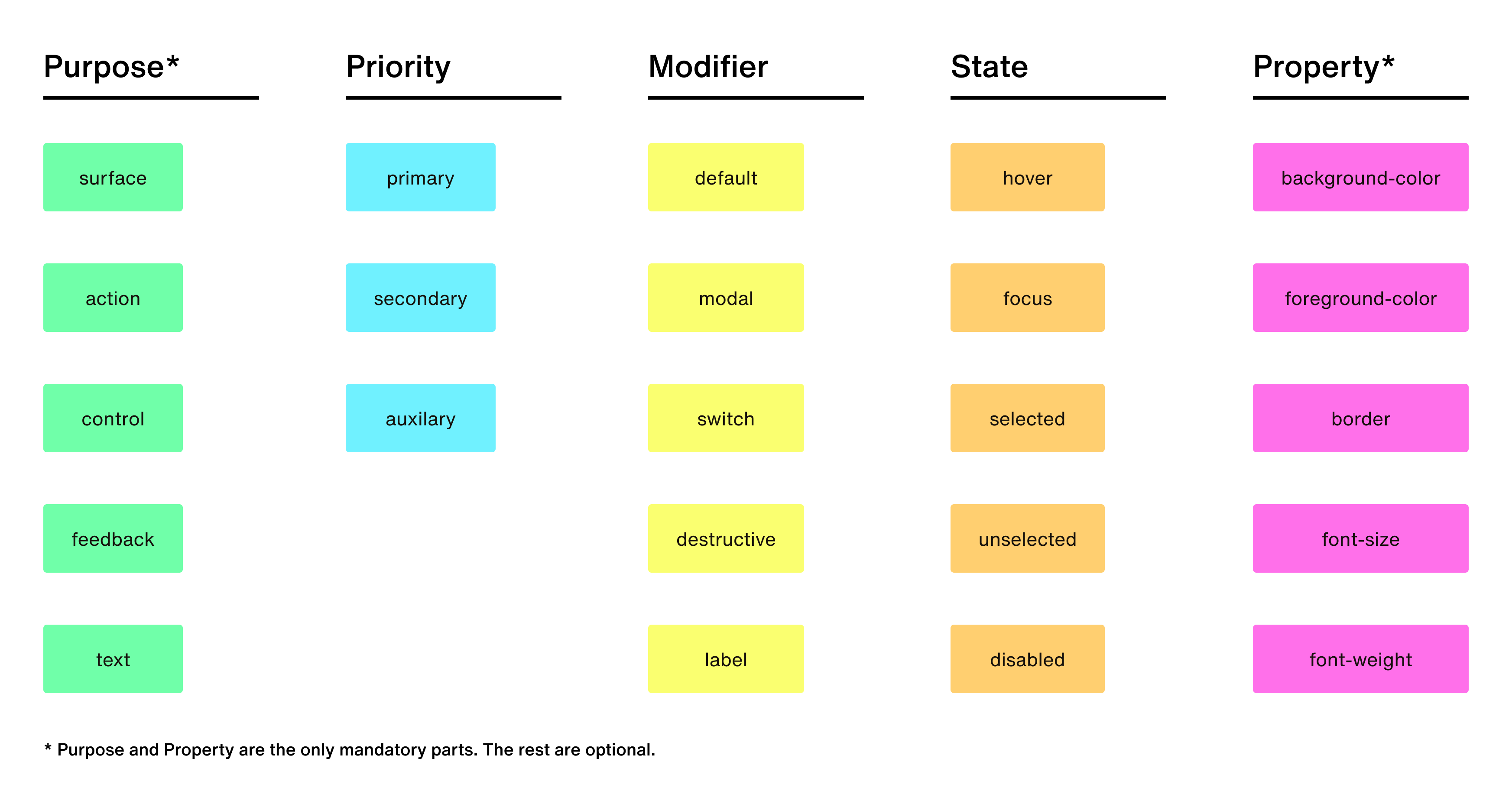
Anatomy
Our tokens are built using five main parts: purpose, priority, modifier, state, and property.Purpose
The purpose defines the token’s role in the user interface, based on user expectations. There are five categories:| Purpose | Example token | Typical use |
|---|---|---|
| surface | --surface-primary-background-color | Non-interactive regions where content lives (modals, cards, dropdowns, entire pages) |
| action | --action-default-foreground-color | Interactive elements triggered by user actions (buttons) |
| control | --control-background-color | Interactive regions where users provide values (text fields, sliders) |
| feedback | --feedback-default-background-color | Non-interactive regions that sit on surfaces for system feedback (alerts, badges) |
| text | --text-header-md-font-weight | All text-related elements, defined by font properties (colors come from other purposes) |
Priority
Priority reflects the importance of a UI element to the user. It comes in three categories:| Priority | Example token | Typical use |
|---|---|---|
| primary | --action-primary-background-color | Most important elements (headlines, primary buttons, attention-grabbing modals) |
| secondary | --action-secondary-border | Next level of importance (body text, secondary buttons, interactive flyouts) |
| auxiliary | --surface-auxiliary-foreground-color | Supporting elements (help text/messages, minimally-designed buttons) |
Modifier
The modifier part describes specific visual or semantic treatments within a given token purpose, distinct from priority. While priority indicates hierarchical importance, modifier captures alternative stylistic or contextual presentations. Modifier is optional and only apply when further differentiation is necessary beyond purpose and priority.| Modifier | Example token | Typical use |
|---|---|---|
| default | --action-default-background-color | Standard interaction elements |
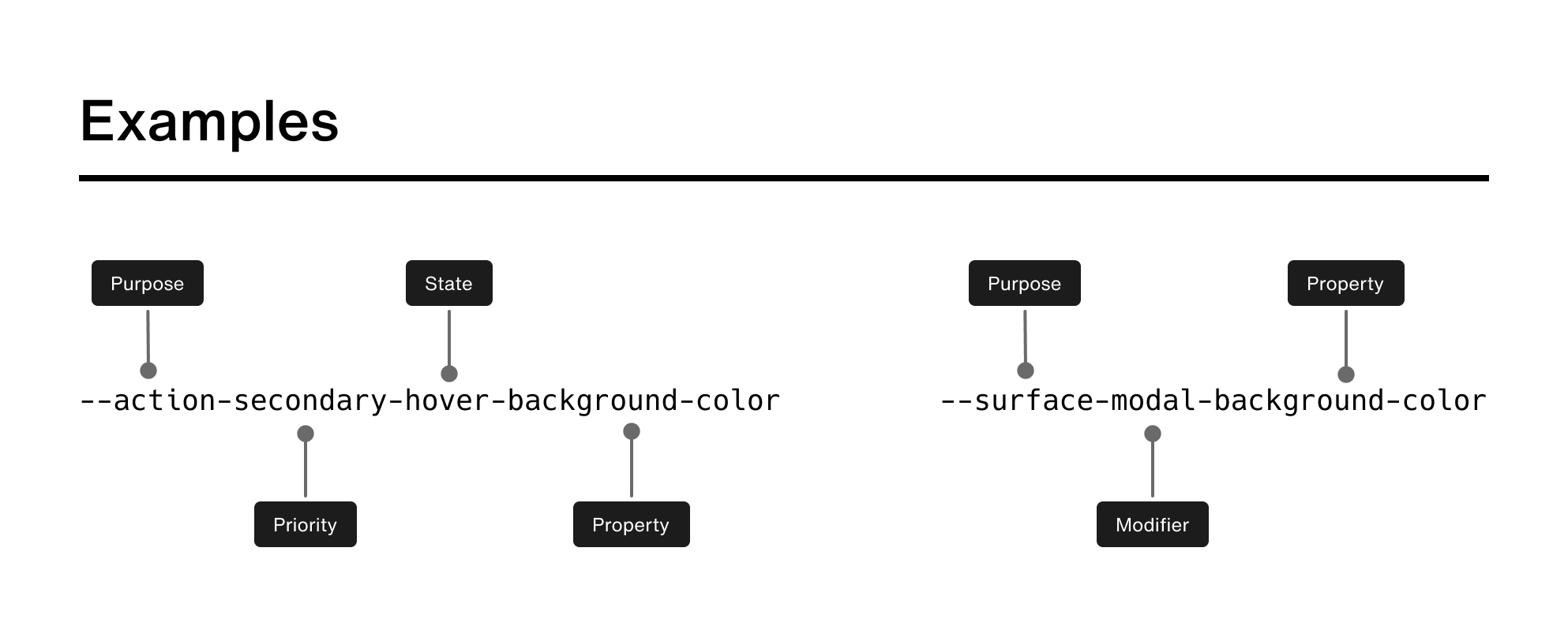
| modal | --surface-modal-background-color | Elevated overlays (dialogs, drawers) |
| switch | --control-switch-background-color | Toggle controls |
| destructive | --feedback-destructive-background-color | Error or alert states |
| label | --text-label-font-size | Descriptive text for inputs or controls |
State
States describe momentary conditions of interactive elements. They modify the base token without changing itspurpose, priority, or modifier.
| State | Example token | Typical use |
|---|---|---|
| hover | --action-secondary-hover-background-color | Pointer resting on the element |
| focus | --action-default-focus-border | Keyboard or programmatic focus |
| selected | --control-selected-border | Element actively chosen |
| unselected | --control-unselected-border | Element available but not selected |
| disabled | --action-default-disabled-foreground-color | Element unavailable for interaction |
--action-secondary-focus-background-color.
If no state is necessary, this part is omitted.
Property
The final part of a token describes the stylistic property being modified. Here are some general ideas, but available properties depend on the category:- surface, action, modifier, and control categories handle properties like
color,corner-radius, andborder. - text handles font-related properties.
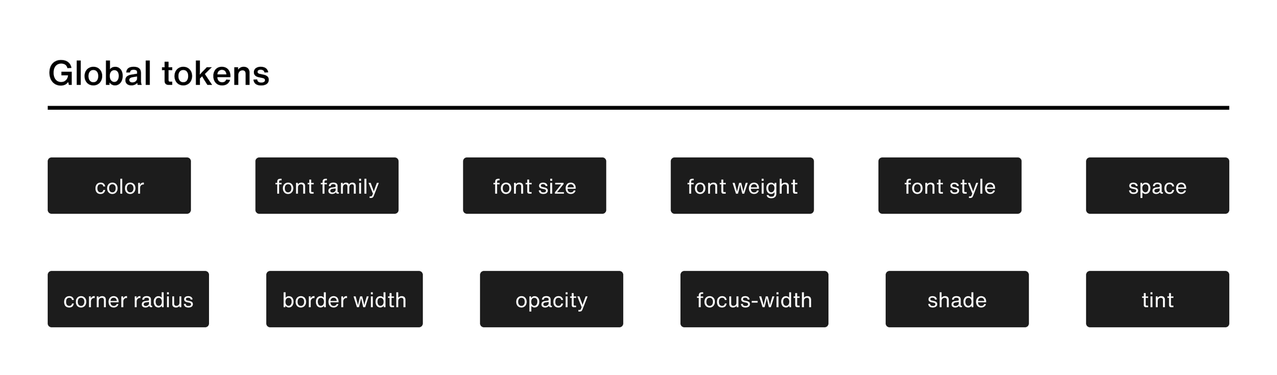
Global tokens
Global tokens live outside the purpose/priority/modifier/state/property hierarchy and solve cross-cutting needs.| Global family | Example token | Typical use |
|---|---|---|
| color | --color-blue-500 | Base color palette for all UI elements |
| opacity | --opacity-50 | Overlays and disabled states |
| space | --space-100 | Consistent padding and margins |
| corner-radius | --corner-radius-100 | Border radius for UI elements |
| font-family | --font-family-text | Typography system fonts |
| font-size | --font-size-200 | Typography scale for text elements |
| font-weight | --font-weight-500 | Text emphasis and hierarchy |
| border-width | --border-width-100 | Stroke thickness for borders |
| tint/shade | --tint-100 | Overlay effects and transparency |
Footnote—Modes
All semantic token names remain constant across visual modes (Light, Dark, High-Contrast, etc.). A mode switch alters only theproperty of a token, ensuring designs reference the same intent regardless of user theme. Support for Dark and High-Contrast modes is planned for future releases.